For our scene magazine cover shoot we wanted it to have an edgy grunge based theme.
We had to find a location for the shoot that was relevant to the theme the brief was asking for so we looked at various places around the city centre, looking more into shape and texture from the lines and angles in the surroundings, that could also be portrayed in the model.
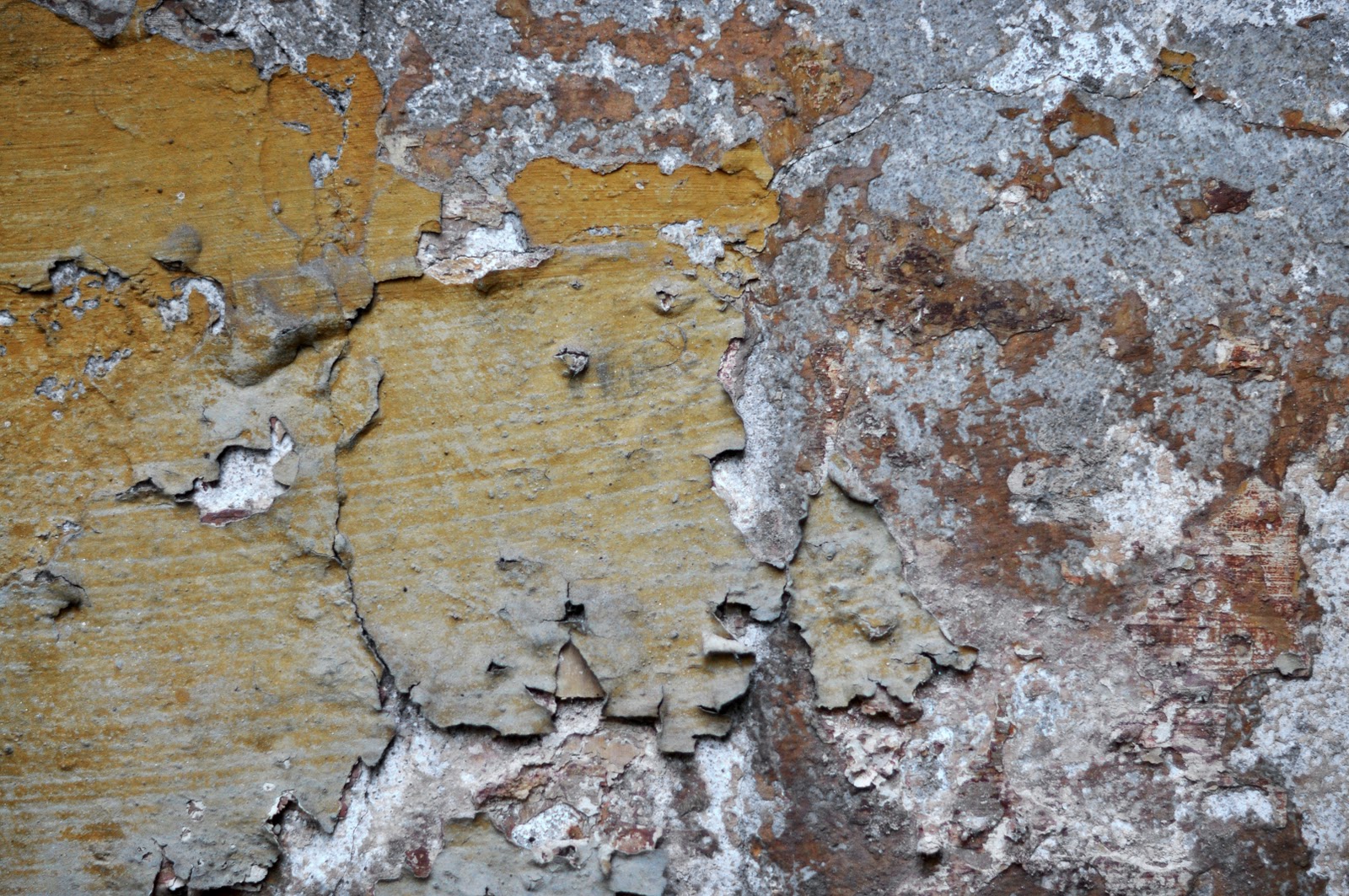
We took pictures of things that we found looked interesting and had a good sense of shape and texture.
We looked at scenery and dirty old buildings also we looked at brick walls with graffiti or old rotting walls etc.
We couldn’t decide upon a location because all the ones we found were so interesting so we took several in different places the locations we decided to use where brick walls with graffiti on them and around by the canals.
This will make a good cover shoot because of it having an interesting background, as you get shape with lines from the fence behind that juxtapose with the model as the lines are at an angle. We wanted the subject to be bold but not take away all the attention from the background.
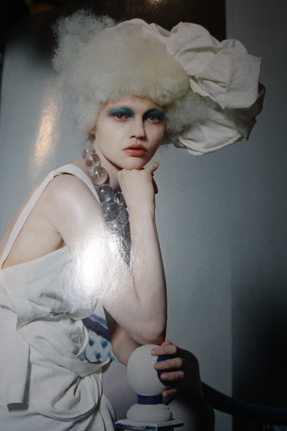
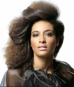
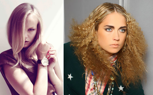
Still using the elements of shape and texture through hair and make up on the model. We decided we wanted the hair to be big, stand out with a lot of volume and have an Afro Caribbean look. The hair was styled with a quiff and backcombed for plenty of volume. As the photograph we decided is going to be just a headshot, we wanted the hair to be past the shoulders that way the model could fill the lens, but still being able to see the background.
Initially we wanted a high collar that covered the bottom half of the face for an edgy look but this was not obtainable.
Looking into that we found an alternative which was to dress the model in a boob tube to create a straight line to work with shape but an additional we might use is a military style jacket in red and one in black. This would also have a straight line going down the middle of the jacket. Also referring to shape in our photograph, we took into account the shape of the models hair, which was a big round quiff linking well to the big bold round earrings.
To make the model stand out more, we decided we would like to use big bold chunky accessories like necklaces and big bold studded earrings to it will stand out and give an added effect to the cover. The make-up we wanted to use would be simple bold block colours, across the eyes to make the eyes bold and stand out; this was also referring to shape from a simple red strip straight across the eyes linking completley to the straight line of the jacket and the straight line across from the boob tube.
The colour of the strip was a vibrant red across the eyes this will work well with the red military jacket. We didn’t want to use any mascara or eyeliner on the eyes that way it doesn’t bring away the attention from the red strip. The contrast of the bright bold red and the natural colours from the background will work well together and help the model to stand out more.